Tuesday, December 29, 2015

Thomas Sargent Recounts History of U.S. Debt Limits

The interview below is from the IMF Survey. Also, see my interviews with Thomas Sargent in 2002, 2012, and a recap in 2015 after Sargent winning the Nobel-Prize.


In a recent visit to the IMF, Nobel Laureate Thomas Sargent brought to life the economic and financial history of the United States, with stories of how debt limits have evolved over the years before and since the creation of the Bretton Woods Institutions.

On December 2, Thomas Sargent, 2011 Nobel Laureate in Economics, delivered the inaugural Richard Goode Lecture at the IMF. Convened by the IMF’s Fiscal Affairs Department (FAD), the Richard Goode Lecture, named after FAD’s first director, who served from 1965–1981, is designed to bring together annually academia and policymakers to discuss important topics of fiscal policy.

As noted by David Lipton, First Deputy Managing Director of the IMF, the forum “will offer an opportunity to reflect on the evolution of fiscal policy and think about fiscal challenges that lie ahead.”

In his address, Sargent, the William R. Berkley Professor of Economics and Business at New York University, the Donald L. Lucas Professor in Economics, Emeritus, at Stanford University, and Senior Fellow at the Hoover Institution, discussed the role debt limits have played throughout the economic and financial history of the United States. IMF Survey sat with Sargent to discuss his work on the debt limits.


IMF Survey: Professor Sargent, could you please explain the role debt limits have played in the economic history of the U.S.?

Sargent:
Based on the evidence that my friend George Hall and I have assembled, the answer is different before 1917 and after 1939.

Before 1917, there was not an aggregate debt limit. Instead, interestingly, there was a debt limit bond by bond. Congress designed every bond and put a limit on the amount that could be issued. And those limits were taken seriously. They seem to have provided information about what upper bound on what future debt would be, except during wars.

After 1939, an aggregate debt limit was created for the first time. It restricts the par value of the total amount of debt. If you adjust for inflation, in real value, the government debt limit was constant until a little after 1980. It actually went down after 1945. In real terms, the value of debt relative to GDP went down even more. After 1983, nominal debt limits rose and more than inflation except in the Clinton administration. So, as I said, the answer seems to differ substantially after 1939 and before 1917.

IMF Survey: And what was the reason for moving from this bond-by-bond approach to the aggregate limit?

Sargent:
Good question. The U.S. Secretary of the Treasury, Andrew Mellon, gave his reasons. After World War I, the federal government had big debts. These debts were in discrete issues of bond of particular maturities. They were issued in big lumps with “echo effects”: lumpy debt service events; potential liquidity and roll-over risks. In the 1920s, the U.S. ran a primary surplus, but not big enough to service all the debt that would come due. So when those big bonds matured, Mellon knew that he was going to have to ask Congress for authority to issue new bonds. He foresaw those “echo effects”. So he asked Congress for authority and flexibility to smooth those things over time. Congress assented. Mellon wanted to manage the debt in ways that would increase the liquidity and allow him freedom basically to be a good portfolio manager.

It is interesting why Congress assented to Mellon’s request while it had denied such requests from earlier Secretaries of the Treasury. You have to know more about the politics of the times than I do to answer that question. The Republicans had big majorities in Congress in the 1920s and they mostly trusted Mellon. Congress evidently thought Mellon’s was a reasonable request and at that time he was respected a lot.

IMF Survey: When would debt limits work effectively in restricting spending?

Sargent:
I don’t know. I began this talk [Richard Goode lecture] with a quote from a smart Assistant Treasury Secretary who said debt limits are totally a sideshow, meaning that they are totally irrelevant. Just entertainment. But if you go back to 19th century, they seem to have been taken seriously. In various episodes, they constrained what the President and the Secretary of the Treasury could do, or thought that they could do. Something must have changed between then and now. We are trying to learn more about those changes or at least to frame the question.

IMF Survey: What lessons can policymakers in other countries learn from the U.S.?

Sargent:
This is speculative, but the way I look at it is that any decision maker, whether he or she admits it, has two things: (1) a model about the way the world is put together, and (2) some interests they want to advance or protect, that is their constituents’ interests. To me, they try to do the best they can in terms of their constituents’ interests, given their understanding of the way the world is put together. They have theories of economics, including theories about government fiscal policy, whether it matters or not, how it matters.

I think if you go back in the 19th century and try to read and listen, people talk about their theories. Congressmen and journalists discussed and debated them. Presidential elections were fought about intricate technical matters of monetary policy: the silver standard, the greenback, the gold standard, bimetallism. It looks to me as though people on both sides had a common theory.

I believe that the economic doctrines that are in policymakers’ heads are very important. It is very corny to say it, but it is still true.

IMF Survey: How about the IMF? What can we learn from this history?

Sargent:
The IMF was set up for good reasons. Keynes and Harry Dexter White and many other good people wanted to solve problems that had devastated the world economy after World War I: adjusting international monetary policies and international debts. The founders of the IMF had theories about how the international monetary system could be set up to handle adverse events in ways that would attenuate adverse consequences.

I see a pretty straight line: the IMF has embodied that theory in a set of practices. I view it as an important institution that seeks to keep alive the thoughts and concerns of its founders. For better or worse, in some countries, they say we don’t want to do it the IMF way. Well, the IMF way is that you have to respect the government budget constraint, mostly from your own domestic taxpayers’ resources, not from abroad. If you want some good outcome, this is what you have to do. A lot of this is just arithmetic and sensible economics. (Some of the arithmetic is unpleasant—that is one reason they call ours “the dismal science”.) The package of IMF policies is coherent and makes sense.

IMF Survey: What is the most interesting thing you have learned from your work?

Sargent:
To me, one of the most fascinating things is how the U.S. Congress and Treasury recognized and managed rollover risks and interest rate risks; and how they thought about the sources of the fundamentals that drove interest rate risk, some under the government’s control, some not. Many of their discussions and decision seem very wise and modern. The government did various things about rescheduling and issuing callable debt and exercising call options. It was quite a sophisticated operation, done 150 years ago. We are trying to understand: (1) were those good things to do; and (2) what motivated those decisions.

IMF Survey: What’s next for your research?

Sargent:
Debt limits are just a part of what we are doing. We are digging deeper and trying to find interesting stories behind individual episodes. Then, we hope to tell some convincing stories—and supplement them with sensible analysis.

Wednesday, December 23, 2015

Understanding China's Housing Market

From the Global Housing Watch Newsletter: December 2015


For several years, analysts have been expressing concerns about China’s housing market. “Boom to bust: China's property bubble is about to burst”—this was the headline of an article in the Economist magazine in 2008. Fast forward a few years and we continue to see similar headlines. “Haunted housing: Even big developers and state-owned newspapers are beginning to express fears of a property bubble”, in 2013. “End of the golden era: China’s property market is cooling off, at long last”, in 2014. These days, together with the housing market, analysts are also expressing concerns about the overall health of the Chinese economy. Here is one headline from 2015: “Coming down to earth: Chinese growth is losing altitude. Will it be a soft or hard landing?”

So why China’s housing market has not seen a bust yet? At last weekend’s conference in Shenzhen on December 18-19, leading experts on China’s housing market provided some answers. The conference—International Symposium on Housing and Financial Stability in China—was organized by the Chinese University of Hong Kong in Shenzhen, International Monetary Fund, and Princeton University.


Getting the facts right: housing and mortgage market


New research by Joe Gyourko (University of Pennsylvania) and his co-authors provides facts on China’s housing market from a supply and demand perspective. “In China, different housing markets behave very differently. A boom in Beijing and Shenzhen doesn’t mean a boom everywhere”, Gyourko said at the conference.

In his presentation, Gyourko made two key points. First point: there is substantial heterogeneity across cities in the balance between housing supply and demand. At one end, housing supply has outpaced demand in the interior part of the country. Specifically, housing supply has outpaced demand by at least 30 percent in twelve major markets and by 10 to 29 percent in another eight markets. On the other end, housing demand has outpaced supply in most major eastern markets. These include: Beijing, Hangzhou, Shanghai, and Shenzhen. Second point: markets such as Beijing, despite their strong measured fundamentals, should be considered somewhat risky because homes there trade at very high multiples of rent.


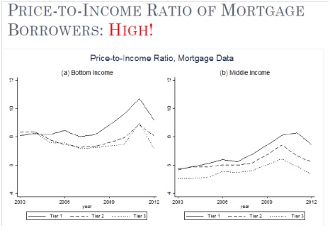
Another new piece of research, by Hanming Fang (University of Pennsylvania) and his co-authors, provides facts on China’s housing market from the mortgage market perspective. They have constructed a set of house price indices for 120 major cities in China and used a comprehensive data set of mortgage loans from 2003 to 2013. In his presentation, Fang showed that the Chinese housing boom has been accompanied by strong growth in income, and high mortgage down payments. For a decade, household’s disposable income has had an average annual real growth of 9 percent at the national level. Also, down payments have been over 30 percent on all mortgage loans.


However, Fang noted that the participation of low-income home buyers in the housing boom has been characterized by high price-to-income ratios. The ratios are around eight in second and third tier cities, and even ten in first tier cities.


Wednesday, December 9, 2015

Housing Market in Kuwait

"Prices have shown some signs of softening (...) As of July 2015, prices across the residential and investment property segments have seen average prices fall in year-on-year terms by 6 and 7 percent, respectively (...). As residential prices began to fall in the first half of 2014, average investment property prices began increasing, rising by some 71 percent between March and September. After peaking in September 2014, average investment property prices have fallen by approximately 32 percent as of July 2015. Residential prices bottomed out in October and subsequently recovered by about 44 percent during the same period. These trends, however, do not offer strong evidence of a housing price downturn", notes the latest IMF report on Kuwait.


On the policy front, the report says that "Macroprudential tools can help mitigate potential risks posed by banks’ high exposures to the real estate sector. It is important to ensure that macroprudential policies are reviewed constantly to ensure that they do not exacerbate any property price correction, while preempting the buildup of excessive risks related to real estate exposures. (...) House price growth is a core indicator to monitor and the authorities should construct indices for residential properties as well as commercial properties. Also, other indicators, such as both the average and distribution of the LTV and DSTI (DSC) ratio, should be collected and analyzed to adjust macroprudential policy measures properly and swiftly."

Monday, December 7, 2015

Sweden's Housing Market

"The housing market shows imbalances, with double-digit price gains as the urban population outpaces construction, pushing up household debt from already high levels. Dwelling price rises accelerated to 16 percent y/y in September, led by apartment price increases exceeding 20 percent in Stockholm and Gothenburg. Housing supply is constrained by construction impediments and rent controls while demand is bolstered by population growth and urbanization, rising income and financial savings, and historically low interest rates. Households need to borrow more at higher house prices, with mortgage credit growth of 8 percent y/y in September lifting household debt to 176 percent of disposable income (195 percent including housing associations)", according to the IMF new report on Sweden.


In terms of policies, the report recommends that:
  • "Housing supply should be enhanced through land sale and planning reforms, which will also facilitate more competition in residential construction. Rent controls should be eliminated on new rental apartments and phased out more broadly." 
  • "Mortgage interest deductibility should be phased out to moderate housing demand over time and limits on capital gains tax deferrals raised to release pent up supply." 
  • "A debt-to-income limit should be adopted to contain rises in the already sizable share of highly indebted households, which adds to macroeconomic vulnerabilities." 

A separate IMF report looks at the role of supply constraints in driving prices of owner-occupied housing using municipal-level data.

Monday, November 30, 2015

Labor Migration across U.S. States: An Update

A high degree of mobility has long been considered a distinguishing feature of the U.S. labor market.

A commonly-held view is that when a U.S. state is experiencing tough times (relative to other U.S. states), workers quickly leave the state for greener pastures; this keeps the state’s unemployment rate from going up too much and its labor force participation rate from declining too much.

My new work (with Mai Dao and Davide Furceri) offers a less sanguine view of the ability of U.S. workers to shield themselves from the consequences of adverse shocks. We show that, particularly in the short run, the adjustment to tough times occurs more through unemployment rates going up than through people leaving the state. And while migration picks up during recessions, people in the states that are doing very poorly have a difficult time exiting.

Here is a link to the paper and a technical summary of the paper:

Our first key finding is that labor mobility is less important as a cyclical adjustment mechanism, relative to changes in unemployment and participation, than suggested in earlier work. Some of this shift in view comes from the addition of over 20 years of data to the previous work. But the main reason is that, given the availability of official interstate net-migration data starting in 1991 we can also directly look at the behavior of migration, as opposed to backing it out as a residual. We find that it is primarily the relative unemployment rate, not net migration, that is the main adjustment mechanism in the first two years following a relative shock to state labor demand.

Our second set of findings pertains to a newer literature that documents longer-run movements in U.S. mobility, particularly the steady and widespread reduction in gross internal migration rates since the 1980’s. Here we establish several results that reveal important patterns in regional adjustment mechanisms.

  • First, in the last two decades or so starting 1990, the response of net migration to given regional shocks in the short run has decreased, as has the response of relative unemployment and participation rates, resulting in less dispersion of employment growth in response to given dispersion in relative labor demand shocks.

  • Second, the smaller migration response to shocks is driven entirely by less net out-migration from states that experience adverse labor demand shifts, whereas the net in-migration response to states with favorable labor demand shifts has increased or remained constant (depending on time horizon). This also suggests that in-migrants to the best states do not disproportionately come from the poorest states, a sign of lack of migration directedness and of scope for efficiency gains from an aggregate perspective.

  • Third, despite the trend decline in gross migration rates since the early 1990’s, the migration response to a state-relative demand shock increases strongly in recessions, hence potentially playing a larger role as shock absorber during aggregate downturns than in normal times. Importantly, we observe that this counter-cyclical response of migration is driven primarily by a stronger response of positive net migration into states that do relatively better during recessions, while negative net migration from states that do relatively worse only increases by less and the response is delayed, occurring toward the end of the recession. When a state like North Dakota does relatively better than average during a recession thanks to the shale gas boom, it attracts disproportionately more in-migration than for instance Texas during an expansion, when strong demand for oil creates more jobs in Texas than elsewhere. However, the migrants into North Dakota during the recession do not come disproportionately more from states that are doing worse than average, say Michigan, as one would expect.

Fund Fires Employment Guru?

So, did the Fund fire its employment guru? Well, not quite, but after five years at the helm of the Fund’s Jobs & Growth working group, Prakash Loungani is moving on to other assignments. RES GESTAE spoke to him about the group’s travails in promoting the Fund’s work on jobs, growth and equity.


RG: What was the group set up to do?

Loungani: On jobs, the immediate task was to remind people that sometimes unemployment is high because demand is low. The Fund, like many others, often veers towards thinking of unemployment as largely a supply-side problem—people are lazy or we give them very generous unemployment benefits so they don’t search for jobs or there are structural problems that keep unemployment high. At the onset of the Great Recession, Olivier (Blanchard) and Min (Zhu)—who had oversight over the group—were worried that we would underplay the most obvious explanation for why unemployment had spiked up, namely that aggregate demand had fallen. Our mission was to keep the words “aggregate demand” alive within the building and outside.

RG: Did you succeed?

Loungani: Perhaps more outside the building than within it, at least initially. Under Olivier’s supervision—he gave me a two-page outline and said “follow this”—Mai Dao and I wrote a 2010 paper which Paul Krugman praised: “A recovery in aggregate demand is the single best cure for unemployment. What a relief to hear the IMF say that!” This sentiment was echoed by many others over the ensuing years, including many in the trade union movement. We had a tougher time at other institutions: after one of my presentations in Europe a person came up to me and said: “I heard the same thing from Olivier 30 years ago and I didn’t believe it then.”

RG: And within the Fund building?

Loungani: It has been a tough sell. Larry Ball (of Johns Hopkins), Davide Furceri, Daniel Leigh and I kept up a drumbeat that the short-run relationship between output and unemployment—known as Okun’s Law—had remained stable through the Great Recession. Antonio Spilimbergo started calling us the “Okun police”. I think it eventually started to rub off; one piece of evidence is EUR’s paper on the rise in youth unemployment, which provides an even-handed treatment of the respective roles of aggregate demand and supply factors.

RG: What was the task on growth?

Loungani: Olivier put it as “moving beyond mantras”. Both he and I had the view that the Fund goes to countries and says: “Here are 25 (structural) areas on which you are behind international standards. Improve on all them by next year and you will surely grow”. So I started to look through the Fund’s advice on growth.

RG: What did you find?

Loungani: That the characterization is unfair. Though you can still find examples of the kind I mentioned, the bulk of the Fund’s advice on growth is actually quite ‘granular’; that is, it digs down to see the specific problems the country is facing. Think, for example, of the great work that Patrizia Tumbarello and many other Fund staff have done in providing advice to small states on sustainable growth.

RG: So what did the group do?

Loungani: In the “Jobs & Growth” Board paper, we summarized the current ‘do’s and don’ts’ on growth and then showed that staff had been broadly following that advice. We also issued a very nice guidance note for Fund staff on how to tackle growth issues—I am not praising myself here as this was largely the work of several SPR colleagues. In this case too, as with jobs, we got some external recognition—in this case some back-handed praise from Dani Rodrik, who in the past has been critical of our advice on growth.

RG: And, finally, on inequality?

Loungani: Here the guidance came largely from Min (Zhu), at least initially. Around 2010-11, when the group’s work started, Min was more concerned about inequality than was Olivier. Min said we should see how policies, including Fund policies, affect inequality, so we could take these effects into account in our surveillance and program work.

RG: So does Fund policy advice affect inequality?

Loungani: One of the first things we did was to see how fiscal consolidations—referred to as ‘austerity’ outside our building—affected inequality. In a 2011 piece we found that austerity raises inequality. This initially proved controversial within the building—and, not surprisingly, popular in some circles outside—but management supported us and the paper was published. In 2014, FAD did a very nice Board paper on fiscal policy and inequality and has just issued a new book on the topic. Recently we have shown that openness—capital account liberalization—raises inequality; I hope MCM picks up on this, the way FAD did with fiscal policy. Min also wanted us to see how monetary and exchange rate policies affect inequality; I never got around to it but hope springs eternal—here again MCM could help.

RG: What’s next for you?

Loungani: I have a few residual tasks to complete in the Jobs & Growth agenda. One is to finish extensions of the work on Okun’s Law to emerging markets and low-income countries. The other is to think about the advice the Fund gives to these countries on the design of labor market institutions. This was a topic close to Olivier’s and my hearts; but while Olivier and I did a paper on it for advanced economies (with Florence Jaumotte), I never got around to doing the follow-up paper for other countries. But my main job is to head the division within RES that deals with low-income countries.

RG: And what’s next for the group? Is it disbanded and how would you summarize its impact?

Loungani: Well, my co-chair Ranil Salgado and I have both moved on. But the agenda continues under new management—and the seminar series we launched continues as well. In RES, Romain Duval has taken over and had added structural reforms to the agenda—this is good as the focus we had placed on aggregate demand was appropriate for the time but we should be even-handed. And of course, inequality has become a big deal at the Fund now—with the astounding success of the work by Jonathan Ostry and Andy Berg, the blossoming work on gender inequality, the pilot cases on operationalizating inequality.

On the impact: I suspect Gerry Rice would not call it “huge”. But, in the words of the poet, we managed “to swell a progress, start a scene or two.”

Canada's Housing Market: Which Way Now?

From the Global Housing Watch Newsletter: November 2015


The views on the housing market: New research by National Bank Financial says that “There are now two housing markets in Canada.


When looking at the national level, “moderate overvaluation is still observed (…). The inventory of completed and unsold units has trended higher and is above its historical average in large part because of the multi-unit segment”, says Canada Mortgage and Housing Corporation (CMHC). When looking at the local level, CHMC notes that there is “strong overall evidence of problematic conditions in Toronto, Winnipeg, Saskatoon and Regina. In Toronto, strong evidence of problematic conditions reflects a combination of price acceleration and overvaluation. Strong evidence of problematic conditions in Winnipeg, Saskatoon, and Regina reflects detection of overvaluation and overbuilding.” The divergence in Canada’s housing market is also pointed out by Scotiabank and the Canadian Real Estate Association. On developments in the west part of Canada, CMHC is expecting to see more homeowners fall behind in their mortgage payments as a prolonged slump in oil prices hit household budgets. Finally, the OECD recently released a report warning that the “newly completed but unoccupied housing units have soared in Toronto, increasing the risk of a sharp market correction.” However, Benjamin Tal at CIBC says that the most widely used data on unabsorbed units overstates and misrepresents the level of condo inventory. 


The views on household debt: “Consumer debt is a record 165% of disposable income. Most of that borrowing has gone into buying houses, which now look scarily overpriced”, says the Economist. TD Economics looked at the household debt issue in geographical terms. In doing so, TD Economics finds that “(…), financial vulnerability remains at elevated levels nationally. Households in British Columbia, Ontario and Alberta hold the top three spots, in that order. Households in these three provinces report having the highest debt-to-income ratios, devote the greatest share of income to making debt payments and have built up the highest degree of froth in their housing markets over the last decade.” Meanwhile, the Canadian Centre for Policy Alternatives looked at the household debt issues in terms of age group. It “(…) assesses the impact of a housing market correction on the net worth of Canadian families and finds a 20% decline in real estate prices would leave 169,000 families under 40 underwater, with more debts than assets.” However, the risk of household debt is not shared among the developers and builder community. A report by Ben Myers at Fortress Real Developments says: “The elevated level of household indebtedness in Canada is frequently cited as a vulnerability to the domestic economy, yet none of the builders and developers in our 2015 survey felt it was a significant risk to the housing market.” A new paper by the Central Bank of Canada finds “(…) that high and rising levels of both house prices and debt since the late-1990s can be mostly explained by movements in incomes, housing supply, mortgage interest rates and credit conditions, suggesting that the outlook for house prices and debt could depend mainly on the future paths of these variables.” A paper by Alan Walks (University of Toronto Mississauga) provides a picture of the emerging urban debtscape in Canadian cities, reflecting an essential element of the geography of risk and financialization. His research demonstrates that debt-related risk is associated with high and rising real estate values at each scale. Urban growth has thus brought with it significant new vulnerabilities, mainly related to housing costs and large mortgages, and this is particularly evident within Canada’s global cities.


Sunday, November 29, 2015

Sovereign wealth funds in the new era of oil

From Vox by Rabah Arezki, Adnan Mazarei, and Ananthakrishnan Prasad

As a result of the oil price plunge, the major oil-exporting countries are facing budget deficits for the first time in years. This column goes through the evidence, suggesting that the low price environment is likely to test the relationship between governments in oil-exporting countries and their sovereign wealth funds, at a time when spending is going up.

As a result of the oil price plunge, the major oil-exporting countries are facing budget deficits for the first time in years. The growth in the assets of their sovereign wealth funds, which were rising at a rapid rate until recently, is now slowing – and some have started drawing on their buffers.


Figure 1. Brent crude price, 2014-2015 (US dollars per barrel)


In the short run, this phenomenon is not cause for alarm. Most oil exporters have enough buffers to withstand a temporary drop in oil prices. But what will happen if low oil prices persist, and how will policymakers react? We explore here the fallout from low oil prices on sovereign wealth funds in oil-exporting countries and find that that they have important domestic implications. The impact on global asset prices will depend on the extent of unwinding of the sovereign wealth funds of oil exporters that will not be compensated by portfolio adjustment in other parts of the world that will in turn depend on their economic prospects.


Figure 2. World’s biggest sovereign wealth funds, 2015 estimates


The rise of sovereign wealth funds

In the early 2000s, high oil prices brought about a massive redistribution of income to oil exporters, resulting in current account surpluses and a rapid buildup of foreign assets. Governments established new sovereign wealth funds or increased the size of existing ones to help manage the larger pool of financial assets. The total assets of sovereign wealth funds are concentrated in a few countries. As of March 2015, it is estimated at $7.3 trillion, of which $4.2 trillion are oil and gas related. While there are large differences across sovereign wealth funds, available information on their asset allocation points to a significant share in equities and bonds.


Continue reading here. 

Tuesday, November 24, 2015

IMF's Thanksgiving message: ensure benefits of foreign capital are shared broadly

Opening up capital markets, unless managed well, can raise inequality. That’s the message of a new working paper by Davide Furceri and me that the IMF released today. Paul Krugman, based on the early evidence from our work, wrote:

Davide Furceri and Prakash Loungani use an event-study framework — looking at what happens on average after clear changes in policy — to assess the effects of “neoliberal” policy changes (although they don’t put it that way) on inequality. Sure enough, they find that both fiscal austerity and liberalization of international capital movements are followed by noticeable rises in income inequality. So, if you were a ranting leftist, you might say that political attitudes are shaped by class, and that ideological justifications for high inequality are just a veil for class interest. You might also say that “sound” economic policies are really just policies that redistribute income upwards. And it turns out that the econometric evidence more or less supports your rant.”

Well, our evidence holds up to further scrutiny. And the conclusions we’d like you to draw from our work are summarized in our new blog. And then, if you really want to get a break from the in-laws, here’s the paper. Nothing clears the living room better than a statement like “Guys, let me tell you about this fascinating paper – its findings do not imply that countries should not undertake capital account liberalization, but it suggests an additional reason for caution.”

Happy Thanksgiving,
Prakash

Saturday, November 21, 2015

Forecasting: Who keeps the score?

My colleague Hites Ahir has a review and summary of Superforecasting


Superforecasting: The Art and Science of Prediction. By Philip Tetlock and Dan Gardner. Crown; 352 pages; $28.


Here are four forecasts that have been made in the technology field. First: “There is no reason anyone would want a computer in their home”, this was a forecast made in 1977 by Ken Olson—the president of Digital Equipment Corporation. Second: “There’s no chance that the iPhone is going to get any significant market share. No chance”, that was the forecast made in 2007 by Steve Ballmer—CEO of Microsoft. Third: “In five years I don't think there'll be a reason to have a tablet anymore”, forecast made in 2013 by Thorsten Heins—CEO of BlackBerry. Fourth: “Yes, the iPad Pro is a replacement for a notebook or a desktop for many, many people. They will start using it and conclude they no longer need to use anything else, other than their phones”, this forecast was made few weeks ago by Tim Cook—CEO of Apple. In the first three cases, it is safe to say that we know the outcome. In the last case, we will have to wait and see.

Can ordinary people also make forecasts? Who keeps the score of all the forecasts that are made? Why keeping the score matters? What is needed in the forecasting field? Can we do better at forecasting? These are some of the questions that are discussed in a fascinating new book: Superforecasting: The Art and Science of Prediction by Philip E. Tetlock and Dan Gardner. Tetlock is a professor at the University of Pennsylvania and Gardner is a journalist, author, and a lecturer.

The new book by Tetlock and Gardner describes the results from a massive forecasting tournament—the Good Judgment Project—sponsored by Intelligence Advanced Research Projects Activity (IARPA). The idea behind the project was to see who could invent the best methods of making forecasts that intelligence analysts make every day. The participants were asked to make a forecast on different topics. Some of the topics included were: Will OPEC agree to cut its oil output at or before its November 2014 meeting? Will the president of Tunisia flee to a cushy exile in the next month? Will the gold price exceed $1,850 on September 30, 2011? Will the euro fall below $1.20 in the next twelve months? The project recruited a very high number of volunteers. These volunteers came from a very wide range of backgrounds: from retired computer programmer, social service worker, to a homemaker. Below are some of the interesting parts of the book.

Can ordinary people also make forecasts? Here is one example from the forecasting tournament: “With his gray beard, thinning hair, and glasses, Doug Lorch doesn’t look like a threat to anyone. He looks like a computer programmer, which he was, for IBM. He is retired now. (…) Doug likes to drive his little red convertible Miata around the sunny streets, enjoying the California breeze, but that can only occupy so many hours in the day. Doug has no special expertise in international affairs, but he has a healthy curiosity about what’s happening. He reads the New York Times. He can find Kazakhstan on a map. So he volunteered for the Good Judgment Project. Once a day, for an hour or so, his dinning room table became his forecasting center, where he opened his laptop, read the news, and tried to anticipate the fate of the world. (…) In year 1 alone, Doug Lorch made roughly one thousand separate forecasts. Doug’s accuracy was as impressive as his volume (…) putting him in fifth spot among the 2,800 competitors in the Good Judgment Project. (…) In year 2, Doug joined a superforecaster team and did even better, (…) making him the best forecaster of the 2,800 GJP volunteers. (…) This is a man with no applicable experience or education, and no access to classified information. The only payment he received was the $250 Amazon gift certificate that all volunteers got at the end of each season. Doug Lorch was (…) so good at it that there wasn’t a lot of room for an experienced intelligence analyst with a salary, a security clearance, and a desk in CIA headquarters to do better. Someone might ask why the United States spends billions of dollars every year on geopolitical forecasting when it could give Doug a gift certificate and let him do it.”

Who keeps the score of all the forecasts that are made? “More often forecasts are made and then … nothing. Accuracy is seldom determined after the fact and is almost never done with sufficient regularity and rigor that conclusions can be drawn. The reason? Mostly it’s a demand-side problem: The consumers of forecasting—governments, business, and the public—don’t demand evidence of accuracy. So there is no measurement. Which means no revision. And without revision, there can be no improvement.”


Friday, November 20, 2015

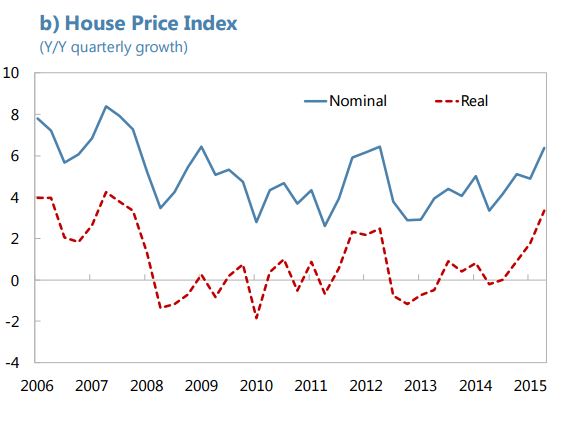
House Prices in Mexico

"House prices have been broadly stable in real terms since 2008, and there are no signs of a real estate bubble", says IMF's new report on Mexico.


Thursday, November 19, 2015

House Prices in Finland

The latest IMF report on Finland says:
  • "Meanwhile, the housing market has cooled and standard metrics suggest that average house prices are broadly in line with fundamentals."

  • "Separately, measures in the reform program to stimulate housing construction should help ease constraints on regional labor mobility. Planned measures include easing requirements for state-subsidized housing construction, reducing restrictions on land use, and streamlining aspects of the permitting and development process."


Tuesday, November 17, 2015

Effects of Wage Moderation in the Euro Area

A devaluation is often a way out of financial trouble for a country. But for many crisis-hit countries in the euro area, devaluation is not an option. ‘Internal’ devaluation—through wage moderation, for instance—is often discussed as an alternative solution for these countries to try to mimic the outcomes of an external devaluation. When does such internal devaluation work? My new IMF paper provides evidence on this using the euro area countries as an illustration. The main finding is that for wage moderation to work when a number of countries are undertaking it at the same time, strong support is needed from monetary policy in the form of quantitative easing. The paper shows that when one crisis-hit euro area country pursues wage moderation, it stands to gain in terms of an increase in its output. But when a few crisis-hit euro area countries pursue wage moderation at the same time, the benefits to each one decline; moreover, the collective wage moderation by the group has adverse spillovers on the other euro area countries, so that euro area output as a whole declines. Quantitative easing by the central bank can offset the decline in euro area output. Here is a blog that summarizes the paper and here is the paper itself.


Thursday, November 5, 2015

International Jobs Report

Read the latest International Jobs Report here.

Friday, October 30, 2015

Housing Markets: Balancing Risks and Rewards

Here is a presentation that I gave at the American Enterprise Institute's (AEI) international conference on housing risks on October 29. Here is the agenda and presentations from other participants. And below is a video that covers the second day of the conference. 


Thursday, October 29, 2015

Global House Prices: Gloom, Boom or Doom?

From the Global Housing Watch Newsletter: October 2015


The heady days of boom in house prices around the world remain elusive. The current state is a mix of gloom and boom. On house price performance at the global level, Knight Frank says that its Global House Price Index recorded its weakest growth in four years. On the performance in advanced vs. emerging market economies, “Real residential property prices continued to increase significantly in most advanced economies in the first quarter of 2015, rising by 3.6% year on year (…) Turning to emerging market economies, real prices decreased by 0.4% year on year”, says the Bank for International Settlements. On country specific performance, Savills says that “There are four ways that the global real estate markets have behaved since 1985 (…): boom-busters [Denmark, France, Ireland, Italy, Netherlands, and Spain], the stabilisers [Belgium, Finland, United Kingdom, and the United States], deflators [Germany, Japan, and Switzerland], and the high-risers [Australia, Canada, New Zealand, Norway, and Sweden]. 

On countries where house prices are booming, the Economist notes that “Taking an average of our two measures [price-to-income and price-to-rent], houses are more than 30% overvalued in six markets [Australia, Belgium, Canada, Hong Kong, Sweden, and United Kingdom].” Meanwhile, Scotiabank points out that “The persistence of historically low interest rates is highly supportive of global housing demand. However, heightened economic uncertainty and still soft job markets remain a headwind to a stronger housing outlook in many nations. Among the more robust housing markets globally, including Canada, Australia, the U.K. and Ireland, stretched affordability could pose an increasing challenge.” All of these developments are happening against a background where the IMF “foresees lower global growth compared to last year, with modest pickup in advanced economies and a slowing in emerging markets, primarily reflecting weakness in some large emerging economies and oil-exporting countries.”


Tuesday, October 27, 2015

On U.S. Labor Market Slack: Updated Estimates of the Impact of Uncertainty on Unemployment

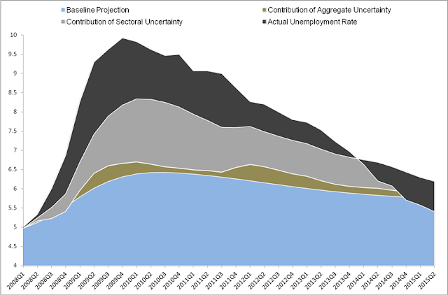
Is uncertainty contributing to U.S. unemployment at present? Based on updated estimates of my work with Sam Choi the answer is “no”. Our measures of aggregate uncertainty and sectoral uncertainty are both back to pre-crisis levels and their contribution to unemployment has dwindled to zero. The chart below shows a baseline projection for unemployment (the portion shown in blue) and then adds on the contribution of other factors to get to the actual unemployment rate.


We find that aggregate uncertainty contributed a bit to unemployment in 2009 and again in 2012 (this is the portion of the chart shown in brown). Our aggregate uncertainty measure is the realized volatility of S&P 500 index returns, similar to Bloom (2009).

Our sectoral uncertainty measure is the cross-section dispersion in excess returns across various industries. We show in our paper that this measure of uncertainty tends to have more persistent impacts on unemployment than aggregate uncertainty. The contribution of sectoral uncertainty to U.S. unemployment was important in mid-2010—this was the result that Bob Samuelson cited in his column at the time. But the contribution of sectoral uncertainty has declined steadily ever since and is essentially zero at present. (This is the portion of the chart shown in grey.)

The main reason for the decline in unemployment is the resumption of growth and unemployment’s own dynamics; their contribution is shown as part of the other factors in the chart above (the portion shown in black).

Details are provided in our paper. Please note that as in other IMF working papers, the views expressed in this paper are those of the authors and should not be ascribed to the IMF.


Saturday, October 24, 2015

Is the Phillips Curve alive? And should we care?

Neil Irwin has a nice article in the New York Times today on whether the relationship between inflation and unemployment -- commonly known as the Phillips Curve -- is alive and why we should care whether it is or not. Click here to judge for yourself. 

Thursday, October 22, 2015

Union power and inequality

From VoxEU:

Inequality in advanced economies has risen considerably since the 1980s, largely driven by the increase of top earners’ income shares. This column [by Florence Jaumotte and Carolina Osorio Buitron (both at the IMF)] revisits the drivers of inequality, emphasising the role played by changes in labour market institutions. It argues that the decline in union density has been strongly associated with the rise of top income inequality and discusses the multiple channels through which unionisation matters for income distribution.

Revisiting the drivers of inequality: The role of labour market institutions

Rising inequality in advanced economies, in particular at the top of the distribution, has become a great focus of attention for economists and policymakers. In most advanced economies, the share of income accruing to the top 10% earners has increased at the expense of all other income groups (Figure 1). While some inequality can increase efficiency by strengthening incentives to work and invest, recent research suggests that high inequality is associated with lower and less sustainable growth in the medium run (Berg and Ostry 2011, Dabla-Norris et al. 2015). Moreover, a rising concentration of income at the top of the distribution can also reduce welfare by allowing top earners to manipulate the economic and political system in their favour (Stiglitz 2012).

Traditional explanations for the rise of inequality in advanced economies have been skill-biased technological change and globalisation, which increase the relative demand for skilled workers. However, these forces foster economic growth, and there is little policymakers are able or willing to do to reverse these trends. Moreover, while high income countries have been similarly affected by technological change and globalisation, inequality in these economies has risen at different speeds and magnitudes.

Figure 1. Evolution of inequality measures in advanced economies


Continue reading here.

Friday, October 16, 2015

Spillovers of Unconventional Monetary Policy

The Peterson Institute for International Economics (PIIE) hosted a conference on "Spillovers of Unconventional Monetary Policy" on October 15. Experts from a wide range of official and private institutions shared their perspectives on the global spillovers of recent policies from the Federal Reserve and other major central banks.

The first panel, "Theory and Evidence of Spillovers," included presentations by Steven Kamin, (Federal Reserve System); Prakash Loungani (IMF); and Michael Klein (Tufts University).

The second panel on "Policy Implications of Spillovers" featured analyses by Joseph E. Gagnon (PIIE) and Reuven Glick (Federal Reserve Bank of San Francisco). Tae Soo Kang (John Hopkins School of Advanced International Studies), discussed their views from his perspective.

The conference concluded with a high-level panel featuring Olivier Blanchard (PIIE); Jose De Gregorio (University of Chile); and Guillermo Mondino (Citi).

Monday, October 12, 2015

Dialogue with Angus Deaton

Congratulations to Angus Deaton for winning the Nobel Prize in Economics. Below is my IMF Survey interview with Deaton (July 2002) on When numbers don’t tell the full story about poverty in India and the world


Before the world can answer questions about how poverty is reduced, it needs to know how progress can be measured. But estimates of the number of the world’s poor and questions about whether it has been decreasing or increasing have given rise to one of the hottest controversies in the development community. Angus Deaton, Professor of Economics and International Affairs at Princeton University’s Woodrow Wilson School, who has looked in detail at India’s poverty numbers, has been at the center of this debate. He speaks here with Prakash Loungani of the IMF’s External Relations Department about the dimensions of the problem and what can be done to provide more transparent and more reliable data on the world’s poor.

LOUNGANI: The World Bank’s estimate that 1.2 billion people live on less than $1 a day is cited everywhere. How reliable is this estimate?

DEATON: There’s surely a very large margin of error in that estimate. Even small changes in the design of the survey used to measure poverty can often have dramatic impacts on the poverty estimates. For instance, you could lower the estimate of the number of poor in India by 175 million just by shortening the recall period from one month to one week.

LOUNGANI: It’s a dramatic example, but you’ll have to explain what a recall period is.

DEATON: To measure poverty, you have to survey people and ask them to recall their expenditures— how much they spent on food, clothing, and so forth. You have to choose whether to ask them to recall how much they spent over the past week or how much they spent over the past month. That’s the recall period. Choosing a one-week recall period generally yields higher expenditures, and therefore lower rates of poverty, than choosing a one-month recall period. (The latter is measured on a weekly basis, of course, so that you’re comparing like and like.) India has long used a 30-day recall period. In recent years, the statistical authorities in India did an experiment to see what difference the recall period makes to the estimate of the number of poor. They found, as I mentioned, that shifting to a one-week recall period would essentially halve the number of poor in India. That must be the most successful poverty-reduction program in the world!

LOUNGANI: But haven’t you been working to resolve such data problems and come up with a good estimate of the number of poor in India?

DEATON: Yes, I have been trying to use the parts of the survey that are consistent over time to adjust the poverty numbers and put them on a consistent track. What that has shown in the end is that there has been fairly steady poverty reduction in India. The number of people living in poverty has declined at a steady rate over the past 20–30 years; there is no evidence of a pickup in the rate of decline since the reforms of the 1990s. I end up with an estimate of a poverty rate for India of 28 percent in 2000. Scholars at the Delhi School of Economics, working independently and using methods quite different from mine, have reached similar conclusions

LOUNGANI: Your findings won’t give much comfort to either side of the debate in India.

DEATON: I think that is broadly right. But the reformers have more to cheer about than their opponents. The findings don’t give the reformers everything they would have liked—notably, a pickup in the rate of poverty reduction in the postreform era. But it certainly shows that the claims of their opponents that poverty reduction stalled as a result of the reforms or that poverty actually increased are quite incorrect.

LOUNGANI: Is the problem just with India’s poverty statistics or is it broader?

DEATON: It is a broader problem, but I should remark that, even with all the problems of measurement, we do know that India accounts for about one-third of the world’s poor. So coming up with a more reliable estimate of India’s poor goes a long way toward getting a better estimate of the world’s poverty rate. But the problems that we face with the poverty data in India are quite likely to be present elsewhere.

LOUNGANI: What are some of the problems with the poverty estimates, setting aside the issues of survey design that we’ve already to some extent discussed?

DEATON: Let me try to get the first problem across in a simple way. Suppose that I had tried to see if income growth in China had any impact on the poverty rate in India. Right away you’d say: “That’s crazy. You need the income and poverty numbers to be from the same country.” Well, in most countries the data on income and the data on poverty come from two different sources. And, exaggerating a bit now to make the point, sometimes these two sources are so far apart in the stories they tell that they may as well be from different countries.

LOUNGANI: For example?

DEATON: The problem is endemic, but again the most dramatic case is India’s. According to its national income accounts, India has had robust economic growth over the last decade, and this certainly accords with what most people think has happened. But, at least until the latest figures came out, the national survey statistics, which are the source of the poverty estimates, showed that average consumption has essentially been flat over the last decade. These two stories about what’s happened in India cannot both be right. How can you have strong growth in consumption in the national income accounts and no growth in average consumption in the household survey? Either consumption hasn’t grown as much as the national accounts say it has or consumption has grown more—and perhaps poverty has been reduced more—than the national surveys say it has. So this, in simple terms, is the first problem—the lack of reconciliation between the household survey and the national income accounts.

LOUNGANI: The lack of price indices is also a big problem, I guess?

DEATON: Absolutely. There are two separate issues here. One is that to compare poverty rates across countries, to make the kind of $1 a day numbers that you mentioned are cited everywhere, you have to use purchasing power parity (PPP) exchange rates. Well, revisions to these exchange rates can play havoc with the poverty estimates. The World Bank itself was caught in this trap: in the 1997 World Development Report, before the crisis, Thailand is shown as having a poverty rate of only 1 /10 of 1 percent of the population. This figure was attributed by then chief economist Joe Stiglitz to the Asian economic miracle. But this was less a demonstration of the miracle than of the dangers of inappropriate PPP conversion. It’s a bit disconcerting when the World Bank’s dream of a world free of poverty can be realized simply by misusing exchange rate data.

LOUNGANI: You said there was a second issue with respect to price indices?

DEATON: Yes, you also need good price indices to compare poverty rates within the country, particularly between urban and rural areas. Countries often have good data for urban centers but not for the countryside, which is often where most of the poor live. This can be a big problem. For instance, I think the unavailability of good price indices for rural areas is in part responsible for the very conflicting views of what impact the Asian crisis had on the poor in Indonesia.

LOUNGANI: If the poverty data are so error-ridden, why don’t we rely on other socioeconomic indicators?

DEATON: That is done. Statistics on life expectancy, infant mortality, and literacy are all things that people look at to supplement the poverty numbers. Amartya Sen has been the intellectual force behind this broader look at deprivation. The United Nations Development Program has come up with a Human Development Index that aggregates all this information in a certain way. I don’t think the way they aggregate it is quite right, but at least it’s wrong in a very transparent fashion. But it is important to realize that income or consumption poverty is an important dimension of poverty in its own right and we should not be using other indicators as a proxy for it, any more than we should be using income poverty as a proxy for health or illiteracy. They are different things.

LOUNGANI: Should we just ignore the poverty numbers altogether?

DEATON: No, that’s clearly going too far. I don’t have objections to the concept of poverty. We do have a notion of poverty, like we have a notion of being cold or being hot; people can generally identify who in their community is poor. But it’s one thing to have a rough notion of poverty in your community, quite another to come up with an estimate of the number of poor in the whole developing world. That, as we’ve discussed, requires a lot of decisions. So what I’m objecting to is the pretense that at the end of this series of decisions we can draw a very sharp cutoff, a poverty line. It encourages a rather Micawberish view of things where the result is taken to be happiness on one side of the line and misery on the other. (“Annual income twenty pounds, annual expenditure nineteen nineteen six, result happiness. Annual income twenty pounds, annual expenditure twenty pounds ought and six, result misery.”) We should admit that the poverty numbers have large margins of error but keep working to improve them.

LOUNGANI: That’s a nice segue to my final set of questions. What institutional changes are needed to get some quality control on the poverty numbers?

DEATON: The often rather informal arrangements under which numbers are produced need to be looked at. I think the poverty numbers were first thought up for the Bank’s 1990 World Development Report. There was a lot of heroic work by Bank economists to put these numbers together. But they weren’t regarded then as frontline numbers. When folks first started doing GDP numbers, a few academics put some numbers together, and they were thought of as interesting and neat rather than solid numbers you could hang your hat on. Now the poverty numbers have become big important numbers on which many things, including the evaluation of the Bank’s own performance, hinge. At the moment, pretty much no one other than Bank economists can tell you how these numbers were put together and how they can be reproduced. So when someone comes along and accuses the Bank of biasing the numbers one way or the other, it’s difficult for an outside agency or independent scholars to leap to its defense and help resolve the controversy. So we need greater transparency at the Bank on how the poverty numbers are going to be put together in the future. You could imagine setting up other institutions to do this, but greater transparency would get us going in the right direction. And helping countries resolve statistical issues is something that the Bank and the IMF should do a lot more of.

LOUNGANI: It’s difficult for the IMF to take a deep interest in poverty measurement when some still call for us to leave the “poverty business” altogether.

DEATON: I’m in favor of the IMF’s staying in the poverty business, within limits. I was persuaded by [former IMF First Deputy Managing Director] Stan Fischer’s remarks at the conference last year [on macroeconomic policies and poverty reduction] as to why poverty is central to the IMF’s mission. He said that the IMF cannot use the “Von Braun defense”— “I just put the rockets up, and it’s someone else’s business where they fall”—to keep out of poverty. I don’t see how the IMF can cleanly mark out its core mission and say that poverty reduction is someone else’s business. The question is, how far do you go? Certainly, you don’t want to turn yourself into the Bank and hire all the specialists it has and replicate all the detailed poverty analysis it does. But showing greater awareness of poverty measurement issues is essential.

LOUNGANI: What are some areas we could focus on?

DEATON: Several of the problem areas that we discussed are areas where IMF economists are very highly skilled. In countries where there are discrepancies between the national income accounts and the national surveys, IMF staff may have some clues about the extent to which fudges in the national income accounts are responsible. The IMF also has had a long-standing interest in accurate price indices because of the need to get accurate measures of real monetary aggregates, real exchange rates, and the like. And I believe the IMF these days actually issues guidelines on how to provide macroeconomic data and assess their quality. That should be extended to poverty data. This is not the IMF changing its line of business, but simply recognizing that to do your business well you have to be well informed about the measurement of poverty.

Friday, October 2, 2015

The Frenchman Who Reshaped the IMF

From the Globalist:

Reflections on the work of Olivier, the IMF’s now retired chief economist. 


The IMF is often caricatured as an institution that wants to nail every problem with the hammer of austerity and structural reforms.

An article in TIME claimed that the IMF tends to “dish out roughly similar advice to all countries, no matter what their circumstances,” noting that a cursory look at the IMF’s website would show that “prudent fiscal policy and reforms” had been recommended to Lesotho, France and Russia.

Whatever the merits of the caricature, Olivier Blanchard, the French-born, former MIT economist who served as the IMF’s chief economist from September 2008 to September 2015, achieved a rare feat.

He not only changed perceptions of the institution both on the inside and the outside but also, even more crucially, managed to reshape IMF policies.

Under Blanchard’s watch, the IMF:


  • lent its support to a global fiscal stimulus during the Great Recession
  • urged a very cautious removal of this stimulus during the Not-So-Great Recovery, and
  • staunchly advocated easy monetary policies—including quantitative easing.

Even a famous critic of the institution agreed: “A recovery in aggregate demand is the single best cure … what a relief to hear the Fund say that,” Paul Krugman cooed about the thrust of IMF policy prescriptions during the Great Recession.

Olivier Blanchard also threw out some controversial ideas for discussion, such as: Should inflation targets be raised?

That idea ran into some predictable criticism (“if you flirt with inflation, you end up marrying it,” said a former German Bundesbank president).

But it also drew fire from friendly sources—Blanchard’s mentor and long-time collaborator Stan Fischer, currently the U.S. Fed Vice Chairman, thinks that a higher target would be a “mistake.”

Blanchard also nudged the IMF towards less doctrinaire positions on several other issues, notably on the use of capital controls during crises.

He thereby gave an impetus to a rethinking that had started after the Asian crisis of 1997-98—see my article for The Globalist entitled “The Vindication of Joe Stiglitz.”

The fiscal triptych

The biggest change that Blanchard brought about was in the IMF’s advice on fiscal policies. This came in three steps:
  1. In early 2008, Larry Summers advocated a U.S. fiscal stimulus that was “timely, targeted and temporary.” Avoiding alliteration’s allure, Blanchard and co-authors advocated a global fiscal stimulus that was “timely, large, lasting, diversified, contingent, collective, and sustainable.”
  2. Next came a chapter in the October 2010 edition of the IMF’s flagship publication (World Economic Outlook), which Blanchard played an active role in shaping. To the question “Will austerity hurt?” the chapter gave a clear answer: “Yes.
  3. And then came three pages that Gavyn Davies in a FT blog said could have “a greater effect on global economic policy than all of the interminable” sessions held in Tokyo that year at the Bank-Fund annual meetings.

This was in the October 2012 World Economic Outlook—and subsequent paper — where Blanchard and his colleague Daniel Leigh showed that “in advanced economies, stronger planned fiscal consolidation has been associated with lower growth than expected.”

Translation: the adverse impact of austerity on output was perhaps larger than had been expected.

The upshot of this work was not that fiscal consolidation should never be undertaken. Rather, it was that one should expect austerity to lower output.

Moreover, this effect could be greater in some circumstances (e.g., when monetary policy was constrained because policy interest rates could not be pushed below zero).

It wasn’t just fiscal

Here are three other areas where Blanchard left his imprint through his own writing, by guiding the work of others or by creating an open atmosphere where his staff could explore new pastures:

Who’s afraid of capital controls?

Blanchard presided over a series of papers by IMF staff that nudged the Fund towards a more flexible position on capital controls.

A December 2012 blog by Blanchard and Ostry “explains the logic and research that underpins the shift” in the Fund’s position.

The “4% solution”

In a paper with Giovanni Dell’Ariccia and Paolo Mauro, Olivier posed the question: “Should policymakers therefore aim for a higher target inflation rate in normal times, in order to increase the room for monetary policy to react to such shocks?”

Though the paper never explicitly advocated a new 4% target (that was done later by Larry Ball in an IMF working paper), and certainly not one to be adopted right away, this quickly became known as the “4 percent solution.”

Inequality

The IMF has received a lot of credit for its work on inequality. The finding that captured attention — by Jonathan Ostry and Andy Berg — was that inequality was detrimental to sustained growth.

Blanchard initially regarded this finding as an interesting cross-section correlation and then as a correlation that had cleverly tapped into the zeitgeist.

It is only more recently, in his foreword to the April 2014 WEO, that Blanchard has come to the view that the implications of inequality for macroeconomic developments are a “central issue.”